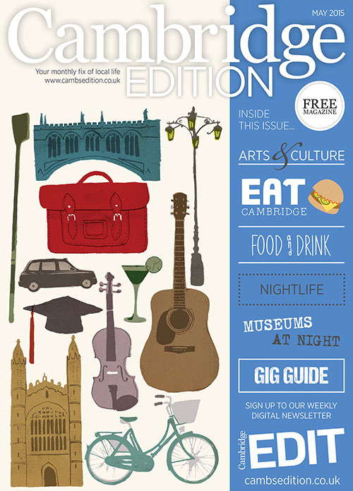
We’ve featured some beautiful images on our covers over the past year and lately teamed up with Anglia Ruskin University to launch a search for our next Cambridge Edition cover. Judging a winner was incredibly tough – so we’ve chosen three! All of them will appear on our cover over the next few months, starting with this month’s suitably ‘Cambridge’ design by final-year student Hannah Bigley, aged 21. We asked her how the project came together…
What were your initial thoughts on first getting the brief? After reading the brief I brainstormed everything I could think of associated with Cambridge, from the iconic landmarks and the botanic gardens to ex-Footlights members and Pink Floyd.
What was your vision for this piece? I wanted to create a piece including all the different things people often associate with Cambridge, as well as some less well-known landmarks to tourists such as the reality checkpoint on Parker’s Piece. I knew I had to include King’s College. I then played around with other buildings such as the Corn Exchange and some houses I saw from the top of the Museum of Cambridge, but neither of them felt ‘Cambridge’ enough.

Did you go with your first idea? My first idea was a drawing of my local pub down the road, it then moved on to King’s Parade and the man playing a guitar in a bin, who sadly didn’t make the final cut!
Is it similar to your usual work? A lot of the work I’ve been creating during my final year has been based around hand- drawn type and printmaking processes. As this was a tight deadline I painted all the components individually and arranged them in Photoshop.
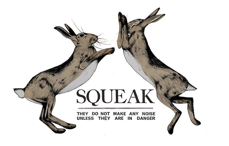
How would you describe your style? I’m not sure… My work has changed a lot since my first year at university! It has helped me realise my interests in music, animals, printmaking and typography, which always seem to work their way into projects. I love 60s Letterpress band posters, as well as old advertisements such as Guinness and Kellogg’s, and discovering ghost signs on the sides of buildings.
What do you most enjoy about making art? I love turning an idea into the final artwork and seeing the outcome of a project. Printmaking is always exciting as it’s so hands on and (mainly) happy accidents can change the direction a project is going in.
Are you pleased with the final result? Yes, it was hard for me to create a piece without including type, so this brief gave me the perfect challenge! Did you get stuck at any point? My first draft was all in greyscale, and I couldn’t figure out why it wasn’t working. A critique at uni advised me to be bolder with the colours, so I revisited the piece and came up with what’s now on the front cover!
What else are you working on? For my final major project I’ve completed some retro looking packaging for boiled sweets and a film poster and accompanying tickets for the Coen Brothers films. I’ve just started a new project on Laura Marling, redesigning a CD/vinyl cover and merchandise to promote her latest album.

