Inspired by the blank canvas of a fresh year, a snowy seasonal palette and 2026’s trending colour, Phoebe Harper consults the experts on how to cast your home in winter white
Few colours can be more divisive in a home decor scheme than white. Done wrong, too much white can suggest sterility and a soullessness that has no place in a home. However, perceptions are changing in the home decor realm towards a white-forward outlook. As we move into 2026, a chalky colour scheme comes to the fore to add depth and warmth to a space.
It’s even been recognised by colour expert Pantone, whose colour of the year has just been announced as Cloud Dancer – a lofty white to symbolise calm, focus and quiet reflection.
Suzanne Hayes is an interiors expert and the director of Headboards & Interiors, a UK-based design studio known for its refined and understated approach to both soft furnishings and bespoke headboard design.
With many years of experience helping homeowners elevate their spaces through incorporating tasteful, thoughtful colour palettes and considered textures, Suzanne has a particular eye for creating calm, cohesive schemes.
“People often think of white as the absence of colour, but in interiors it behaves more like a framework,” she says. “It gives you an incredibly adaptable base that can evolve with you, whether you switch up the artwork, change your soft furnishings or adjust the lighting.
“White is great for people who like their spaces to do multiple jobs because it never competes with what you place in front of it.”
Clean and serene
There is also an element of mindful seasonality behind embracing white in the home at this particular time of year. The shade has long been associated with clarity and relaxation, creating a calming atmosphere within a home. “White is typically synonymous with cleanliness and spaciousness, which is why it’s used in wellness spaces to create a fresh and healing aesthetic,” explains Ethan Fox, an interior design expert at Furniture World.
“Modern homeowners are often looking to create a space where they can relax and unwind after a busy, stressful day, and white provides a perfect, serene environment to do this. We are now seeing a shift towards interior designs that prioritise mindfulness and intentional styling.”
The most important consideration in any home design project is how we want a space to make us feel, and this is where white plays a key role. “White is also known for its ability to maximise space by making a room feel bright and airy,” Ethan adds. “A spacious home is essential when moving into the dark winter months, as you’re bound to spend more of your time indoors.”
Let it snow
In addition to the effect white can have on mood and the way we relax in a room, it’s worth considering the optics it can have on a physical space. Roberta Cirstea is an interior designer at the fully integrated property company CR Group. “Incorporating white as a central design theme is one of the most effective ways to enhance light, open up a space and create a fresh, clear backdrop that supports both calm and creativity,” she says.
“Whether used on walls, furniture or architectural details, it can instantly transform a room by making it feel more expansive, serene and effortlessly modern. When it’s thoughtfully layered with texture, subtle tonal variations and natural materials, white becomes not just a colour choice but a useful tool for shaping interiors that feel clean, contemporary and wonderfully adaptable.”
“What I love about white is the way it quietly organises a space,” echoes Suzanne. “It tidies up visual noise, which is especially helpful in rooms where there’s a lot going on – open-plan living spaces, for example. White naturally sharpens corners, lifts shadows and makes surfaces feel both cleaner and more intentional.”
Meanwhile, for James Mellan-Matulewicz – CEO and creative director at Bobbi Beck, a carbon-neutral design and print studio specialising in sustainably
made luxury wallpaper – white has a timeless appeal that, regardless of any trends, makes it a permanent hallmark
of successful interior design.
“White remains incredibly relevant despite current trends embracing warmer palettes and textured interiors. As layered tones and rich materials take centre stage, white provides the perfect element of balance. The key is to use it as a layered, intentional palette rather than one single flat colour.”
Extra dimensions
When it comes to making white work for you in an interior design scheme, Suzanne recommends that you start by thinking about finish rather than shade. While a matte white on walls hides imperfections and diffuses light, a satin or eggshell white
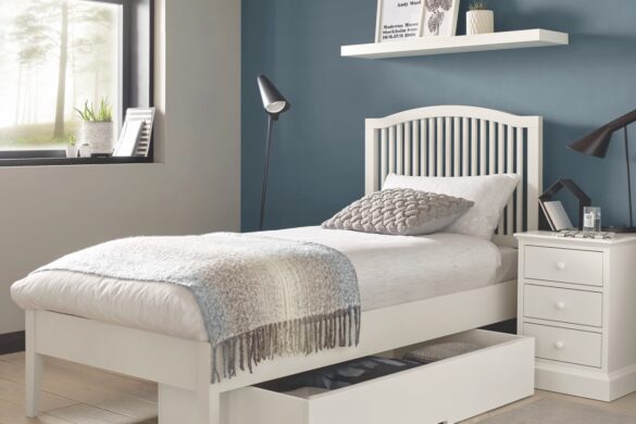
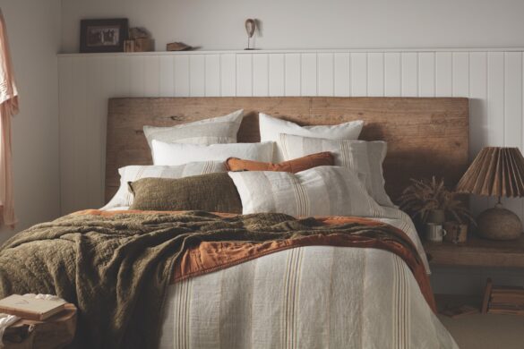
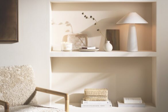
on woodwork will add structure and durability. “My biggest practical tip is to mix materials, not just tones. Pairing a smooth white wall with a woven rug, a chalky side table and crisp bedding gives the room rhythm. If everything is the same texture, that’s when white can start to feel clinical. Give it contrast and it becomes incredibly sophisticated,” she shares.
Similarly, Ethan strongly encourages incorporating a range of different tones such as ivory, cream, off-whites or a calming calico to seamlessly bridge the gap between white and beige, as opposed to a single flat shade. “This will add more depth and dimension to the room, instead of creating a dull and lifeless interior,” he explains. “A mix of textures and materials can be the perfect way to create visual interest in your space while using a simple colour like white. In particular, a woollen throw, linen sheets, fur rugs and marble surfaces can all create an inviting, yet sophisticated atmosphere.”
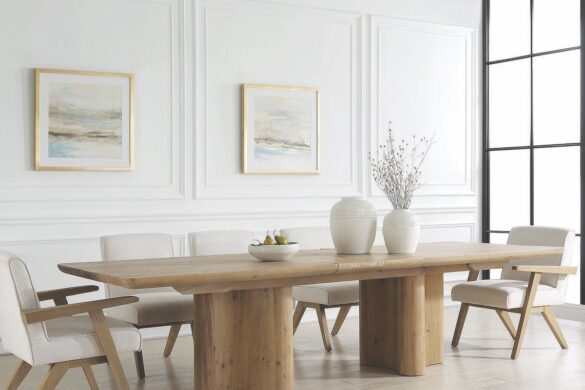
In terms of shade selection, cooler whites tend to lend themselves to brighter, contemporary spaces, while warmer whites enhance cosy, textured schemes. Not such a washout after all, white is a versatile tool that can be employed to elevate any space.
As James tells us: “Even as our interiors become more expressive and personality-driven, this kind of adaptability is exactly why white will continue to play an important role.”

